Ethereum, the dynamic runner-up in the crypto world, has captured the attention of many with its recent price movements. But where is it headed? Let’s delve into the weekly, daily, and monthly charts to decipher the story they tell, using simple language and explanations for regular readers.
Weekly Watch: Crossing the Hurdles to Reach ETH $2780?

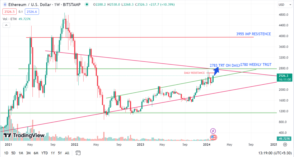
Zooming in on the weekly chart, we see Ethereum currently facing a crucial hurdle at $2626. Crossing this resistance with strong trading volume, meaning many buyers are involved, is key to reaching the next target of $2780. This target aligns interestingly with the upcoming “Dencun update,” adding a technical catalyst to the mix.
However, a wrinkle emerges with the RSI indicator (Relative Strength Index). It’s showing a “divergence,” meaning the price is rising while the RSI isn’t, suggesting a potential pause or pullback before the climb continues.
Decoding the Divergence:
Think of the RSI as a sentiment meter. When it diverges from the price, it can indicate short-term overbought or oversold conditions. In this case, a brief price correction might occur before the uptrend resumes. But fear not, beyond $2780, the chart reveals clear sailing up to $3500, with no major resistance in sight.
Daily Dynamics: Zooming in on Short-Term Movements
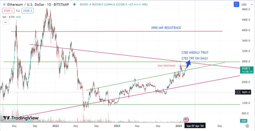
Shifting to the daily chart, we can observe the day-to-day fluctuations that paint a more granular picture. Analyzing these ups and downs, support and resistance levels, and trading volume paints a more precise picture of potential entry and exit points for traders. However, remember, daily movements are highly volatile and should be considered within the context of the broader weekly and monthly trends.

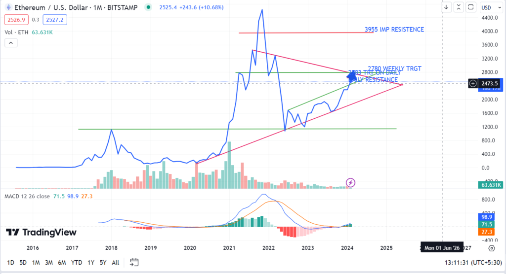
Stepping back to the monthly chart, we gain a long-term perspective. Ethereum’s overall trend has been positive over the past few months, and this chart reinforces the potential for continued upward movement. Identifying historical support and resistance levels on the monthly chart can give us a broader understanding of long-term price targets and potential reversal points

Ethereum Price Analysis: MACD Signals Continued Bull Rally
The Ethereum price chart, analyzed alongside the Moving Average Convergence Divergence (MACD) indicator, reveals promising insights for investors. Since November 2023, the MACD has indicated a pullback in Ethereum’s price, suggesting a temporary dip in the market.
However, this pullback is not indicative of a reversal in trend. On the contrary, the MACD combination indicates that the bull rally in Ethereum is set to continue throughout the year. Despite short-term fluctuations, Ethereum’s long-term trajectory remains bullish, supported by fundamental factors such as increasing adoption, technological advancements, and growing interest from institutional investors.
Investors should interpret the MACD signal as an opportunity to accumulate Ethereum at a potentially lower price point before the next leg of the bull rally begins. As the cryptocurrency market continues to mature and gain mainstream acceptance, Ethereum stands out as a leading platform for decentralized finance (DeFi), non-fungible tokens (NFTs), and smart contracts.
Boost Your Ethereum Trading Strategy: How Line Charts Reveal Key Trends and Patterns
Line charts are powerful tools in visualizing data trends, especially in financial markets, where noise and volatility can sometimes obscure meaningful patterns. These charts help cut through the noise by presenting a simplified representation of price movements over time.
Unlike other types of charts, such as bar or candlestick charts, which display each individual price point with high granularity, line charts connect only the closing prices of a security or asset over a specified time period. This simplification removes the fluctuations and spikes seen in intraday trading, providing a smoother and more streamlined view of the overall trend.
By focusing solely on closing prices, line charts help investors and analysts identify broader patterns and trends in the market without being distracted by short-term fluctuations. This clarity enables better decision-making and helps traders stay focused on the bigger picture, rather than getting caught up in the day-to-day noise of the market.
Line charts are particularly useful for identifying long-term trends, support and resistance levels, and key turning points in the market. They offer a clear visual representation of the general direction in which prices are moving, making it easier for traders to spot potential entry and exit points for their trades.
